
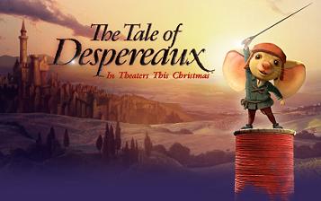
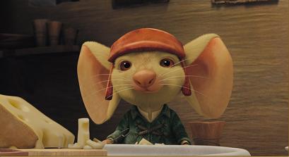
 Unlikely heroes hit the screen in the animated adaptation of Kate Di Camillo’s beloved children best-seller The Tale of Despereaux, a modern-day fairytale from visionary filmmaker Gary Ross (producer and writer of Seabiscuit, Big and Pleasantville) together with directors Sam Fell (Flushed Away) and Rob Stevenhagen (animator on Balto, The Road to Eldorado and Sinbad).
As unlikely heroes make unlikely film, it can be said that the story of a brave little mouse banished to a dungeon for speaking with a human is beautifully rendered thanks to, among others, a one-of-kind art direction, far, far away from medieval clichés and more in tune with European Renaissance art.
Indeed, the art director of the movie is European; French to be exact. An admirer of American animation, Olivier Adam has traveled all over the planet to lend his talents, be it as a layout artist and supervisor for Walt Disney Feature Animation France, a layout director for DisneyToon Studios, Australia and an art director (among other responsibilities) for the Despereaux Studio and Framestore, England. It was in the latter that he expressed his passion for art, European art, and the making of Universal’s animated holiday offering.
Animated Views: On The Tale of Despereaux, you’re credited as director, for designer development and set dressing supervisor. Can you tell me about your different assignments?
Olivier Adam: As an art director, I contributed to define the visual of our movie. Working in close relation with the directors and Gary Ross, I established different locations relevant to the need of the script like “Mouse World” “Rat World” “the Human World”. I tried to create a specific look for all of them without losing an homogeneity over the all movie. Once the location visuals were defined, I was in charge to supervise their realisation in order to keep a constant quality for the look of them throughout the different steps of their making.
I usually started to develop some art concept, then I built a simple 3D rough set to check the scale and some 3D camera; only from there I worked with my artistic team to finalise the look of a set: information for the modelling, the textures and colors, the final 3D set.
I didn’t work on the characters’ design, this was more Evgeni Tomov, the directors and story board artists’ responsibility.
As a set dressing supervisor, this was a full 3D occupation. I wanted to make sure that the final layout – framing and composition – reflected the visual I had in mind. A strong, simple composition is crucial to me in all visual; that’s the first step. Then come the texture, color and in final lighting. I was full time with the layout and set dressing team, driving the final look of the shot for the framing and composition of each visual space. It was important to me to make sure they understand the target between each location.
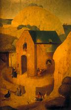
In designer development, that was my first responsibility when I joined the production (and probably the most exciting one!). When I came on board, the movie was already into production since a year in Scotland before moving to London where I joined the team for two years. There was already a generic visual direction established: the Flemish look with some reference to some artists like Bruegel, Vermeer and Bosch [below, right]. Evgeni had already developed a generic look of the city of Dor and the big kitchen. From there, I started to study closely the Flemish painting (which I already knew) but this time in a more analytic way: how was the design in this time, the architecture, the painting composition, the color palette as well as the lights. Developing different concepts, I always tried to base these one on the work of artists of (mostly) the Renaissance.
Reading the script and after a briefing where Gary was explaining how he wanted the characters to be, how they think, how they act, I started to develop some concept art with always in mind the fact that these concepts had to respond to the needs of the storyboard team and a 3D camera environment. Based on previous experiences, I am very cautious with a visual approach based on one great piece of art and then you lose completely the spirit of it just because of the way the camera is moving into it. I prefer to create a few rough art concepts and, from there, move “in spirit” a camera into these different ideas. This process helps me to develop more ideas and check if the concept is working nicely on different points of view. To do so, it allowed me as well to find some interesting storyboard ideas and strong points of view for some specific moments of a sequence. I call this first approach an “art story board”.
 AV: Can you share with us some examples of art concepts which went on to work particularly well?
OA: The castle: First we wanted to avoid the classic “Disney” look. Based on my European culture, the first visual that came up was the stones (size, color, texture) and the opening for the lights (narrow as there was no heating in this time!). Also the importance of the light in the movie made me look towards the Roman Cistercian church and the beauty of the light inside these architectures. I looked as well at some reference of some Flemish church paintings for the simple contrast between the wood and the stone (the banquet hall, the king’s bedroom and Mig’s bedroom were designed with this reference in mind).
For Pea’s bedroom, I wanted it to be in a tower to allow the light to slide and decrease gently over the wall (no sharp angle). Very sober in term of furniture as it was in this time. But to compensate this simplicity, I played a rich “Pea” design for all pieces of furniture and some part of the room like the fire place. In addition I wanted to have some rich tapestry texture and embroidery to create a rich royal look plus a nice contrast with the room itself. I had in mind this painting of Matisse called “the atelier in red” and some of his still life with a Vermeer reference for the lighting.
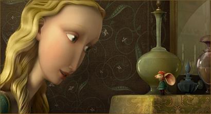
From there I developed some “small world” into this bedroom: the balcony, to be a close private area where the light (or the absence of it) creates visually a stage within the stage. For the dressing table I suggested to take advantage of the design of the shiny and crystal perfume bottles. I had in mind this moment when Despereaux sees Princess Pea for the first time; I wanted to take advantage of the light going through these crystal bottles filled with some pastel colored perfumes to make this moment magical. And the same concept was used nicely for the rat Roscurro with a powerful contrast between his “rat” look and the feminine delicacy of this dressing table.The same perfume bottles were used also for the fight between Pea and Roscurro: the symbol of the broken bottles to reflect the end of a broken dream works quite well to me.
In the script, when Roscurro got chased and found himself secure in a store room there was a key moment when he looked at his reflection in a mirror.This small sequence was important to me: it was the moment Roscurro decided to shift from the “good” side to the ratty “dark” side. To play it well, I wanted to replace the mirror with a copper cauldron playing the same trick like some of this deformed mirror where you look to your own reflection with a mix of curiosity and horror. Doing so, it allowed me to have Roscurro being questioned with his distorted shadow at first and to see this distorted (ratty) projection going back to a normal scale as he walks closer to the cauldron. It seems to me that it was a nice and strong visual way to show the confusion of his mind. For the end of this sequence when Roscurro starts to act like a rat, I created a dark shadowy area under the staircase using some tools like forks, axe, sickle to increase the ratty mood.
For the birth of Despereaux, because it was the first time the audience will met with our hero, I wanted it to look special and magical.We had already decided from some of my previous sketches to have the Tilling Familly to live in a drawers (instead of a lantern as I suggested first). From there I filled the open space of this drawer with a page of parchment. I love the beautiful decorated books the monks used to create in the Middle Age. The letters were beautifully hand drawn and they were added some gold leave incrustations as well as some colored drawings. Having this wall surface done with such a 3D texture would allow me to get some nice, magical reflection over the gold encrustation.
This wall on the side of a bed (done with a silver ladle) was also a wonderful support to catch the moving shadow of a mobile done with shiny element like a pearl or a piece of a stain glass. All these concepts allowed me to increase the beauty of a candle light and make this moment magical. I wanted to bring to this key moment the beauty of a Rembrandt painting. (I used this concept of decorated parchments later on again for the library when Despereaux is reading the knight’s story!)
I had a lot of fun over Mouse world. I wanted this wold to be unique and to have the beauty of the Flemish still life painting. I was referring also to the still life of Chardin (French artist) and Zurbarran (Spanish artist): simple composition, different shapes playing a nice contrast between them as well as different ceramic, wood, glass or metal textures.
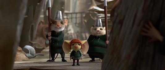
Gary wanted to have the Mice live in a very structured society. So I designed the main spot of their world, Town square, with drawers and boxes to keep a straight, organised look (when I designed later the human world town square I built it as a replicate of Mouse world: the castle is the council court and the entrance a bell tower). From there, the city spread out in a progressive, more disorganised way; the barrels being the mountains of a landscape surrounding their world.
For Rat world I worked closely with Evgeni Tomov. I wanted this world to look like a Roman decadent world (Satiricon from Fellini!). I used the bones to be the columns of strange, weird temples. I built these crazy totems (like some crazy Calder mobiles sculpture) and tried to reuse some of the objects we had already from previous set up to create what we called the medina: rat’s houses built with a weird association of different objects, creating strange, surrealistic shapes. It was a pleasure to create all these visuals!
AV: What was your approach to 3D environments?
OA: We really wanted this movie to do not have the 3D “Playmobil” look you have in most part of the actual 3D animated movies. This does not mean I do not like these movies but it was just not our world.
AV: Indeed, you seem very much attached to this movie!
OA: I really liked the book by Di Camillo and from the beginning I wanted the visual to look magical and unexpected. I wanted this movie to transfer to the kids the same amazement you could have as a child in front of some beautiful illustrations of a book your parents are reading to you before bedtime.When you look back to these drawings, you “jump” into them and tell yourself all a story. I really wanted to get as close as possible to this kind of magical moment.
Also, it was a great opportunity for me to take advantage of my past experiences in animated movies as a background artist, a storyboard artist and, for the most part of it, as a layout artist. I had a lot of fun bringing some ideas which, I think, added to the movie.
And I had a wonderful pleasure to work with great artists on both side: Despereaux productions and Framestore productions.
AV: From Mickey Mouse to Fievel, cinema is full of plenty of mice – without forgetting the latest CG mice of Flushed Away and the rats of Ratatouille. Having that in mind, was it difficult to design new mice and rats?
OA: This was definitively more Evgeni’s creation. It was important to have Despereaux’s design reflect his personality, but also blend nicely with the design of the other characters. Evgeni wanted to avoid any visual association with some already famous mice characters; it was crucial to keep the look of this film unique.
We wanted it to have a painterly look. To make it magical with a wonderful fairytale charm.
The reference to the Flemish art period was crucial for the color palette and lighting as well as for a brush stroke aspect for the treatment of the textures..
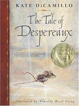
AV: What was your attitude regarding the illustrations of the original book by Timothy Basil Ering?
OA: First of all I really liked them; they helped me feel the poetry of Di Camillo story. And that is probably this aspect (charm and poetry) I tried to keep in my personal visual approach of the movie. On our movie, I think that we also tried to develop a visual we could transfer from a 2D graphic concept to a 3D world in a manageable way.

AV: How did you, the art director, work with the production designer, here Evgeni Tomov?
OA: It was great. We had some good and positive arguments as we both have a strong artistic personalities but it was very productive. We had a very good complementarity in our artistic approach of the movie: one Evgeni’s artistic idea leading me to another one and same in reverse. I truly think the movie gained a lot of bonus because of our collaboration.
AV: What was your biggest challenge on The Tale of Despereaux?
OA: The challenge was at the start to bring a kind of unique visual to the movie. Gary’s suggestion as well as Sam and Rob’s direction were definitively helpful. Also we were lucky to work with amazing artists like Alexei who did most part of the painted treatment of the textures. But, to me, the biggest challenge was to succeed to transfer our vision throughout the complexity of a 3D setting. Being on the spot with the 3D layout team, in a constant communication, was probably the best way to make it happen.
AV: I believe there was another director at the very beginning of the project, The Triplets of Belleville‘s Sylvain Chomet?
OA: I was not part of the production at this time, but from what I heard, Sylvain was more interested in another personal project. The Flemish direction was already there when I came on board. I think that Sylvain brought to the script the concept of Boldo (in reference to the Archimboldo painting). So for him I think it stops there as all the actual look of the movie was done after his short involvement.
AV: How did you work with the directors and the producer?
OA: Probably one of my more pleasant collaboration on a movie. Communication went really well; also we had always the support of Gary and the production all over the movie. I also had a personal nice constructive work relation with Gary, Rob and Sam; I think they appreciated my input in the story through my visual development. And on my side, I appreciated having them to let me do such kind of story propositions
AV: How did you come aboard?
OA: The Despereaux production called me. I was just coming back to France after a stay of four years in Sydney working for Disney. After reading the book and having seen some Evgeni artwork I decided to join the production.
AV: You mentioned you collaboration with Disney. Can you tell me about your work in layout?
OA: Layout is quite different if you talk of it in a 2D or a 3D animation movie. In both cases, the most important is to understand the storyboard to have a clear view of the director(s)’ intention, starting from an overall view of the movie but also for every sequences and scenes. From there the layout will define the best position of the camera in relation to a perspective space. The layout will also work on the continuity and transition from shot to shot.This requires a good knowledge of a movie making as well as a good sens of framing and composition of a frame.
In a 2D animation movie there is also a strong artistic involvement as the layout man is in charge of the drawing of the background as well as all the information relative to the characters animation. This mean a good skill in term of drawing, perspective, animation plus all the information relative to the scene planning and the treatment of the special effects. This step in the making of an animation movie is heavy and crucial. Doing so you develop a good sense of movie making.
I want to point out how important is the work of a camera. I often talk of “camera writing”. You could use the staging of the camera in a efficient but neutral way or try to bring a more personal touch and to put a “soul” into it . A good camera work is to be felt but not noticed. I worked on quite a lot of complex and interesting camera movements on different Disney productions so it is difficult for me to pick up some specific ones (maybe the One By One short Disney movie or on Tarzan, Emperor’s New Groove…well there is a lot!).
But what I would say is that I always had a lot of fun trying to recreate in a 2D world the depth of a 3D world. So when the 3D software started to replace the 2D one it was all fun for me, like a normal extension of my brain. That’s also why, when I was developing a visual, I always conceived it in a 3D space (even when I want it to look flat on purpose).
AV: You worked for both Walt Disney Feature Animation and DisneyToon Studios. Did you feel a different in the working process between the two studios?
OA: I would say yes, maybe just because in 14 years in WDFA I worked on five feature movies and in four years of DTS I worked on six feature DVD movies! But in both cases it was all fun and a tremendous pleasure to work with artists coming from all over the world.
AV: From the layout point of view, what sequence are you the most proud of?
OA: It’s very difficult for me to answer this question as it belongs to the past. Maybe the opening of Tarzan, the sequence of the fight on Notre Dame in Hunchback, the Yzma trip in the jungle in Emperor’s New Groove (my favorite Disney movie for the recent time), the song sequence with Pete in The Three Musketeers, the long one shot in One By One (musical short for a Fantasia project). Speaking about Despereaux I would mention the reveal of Mouse world, the introduction into Rat world, the sequence between Pea and Roscurro… Why I am proud of these? Because the shots are working the exact way we wanted them to work!
AV: What do you like about American animation?
OA: It’s so much alive! Always different with new challenges and so much still to be done.
AV: What do you think about French animation?
OA: Two things: I like the solid and complete artistic culture of French animation artists. I like also the fact that we start to see a new generation of animation movie which are talking to a more international audience. But I am still annoyed with the tendency of us, French people, to be so easily critical in a non constructive way for all the artistic creations, not only in animation!
AV: What projects are you currently working on?
OA: I am currently working since two months on a new feature being done in France called Ruby Tuesday. Just the beginning. Otherwise I try to find some free time for some personal works.
AV: How has a Frenchman become so famous in American animation?
OA: I hope it’s because the directors and supervisors I had an opportunity to work with appreciated my artistic input. Probably also because I am passionate in my job!!
to buy now from Amazon.com
![]()
Our thanks and appreciation to Olivier Adam and Katie Crown.