

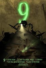
Between technology and spirituality, 9 takes place in a near future when machines have rebelled against their human creators, destroying mankind before being largely shut down themselves. But as our world fell to pieces, a mission began to salvage the legacy of civilization; a group of small creations was given the spark of life by a scientist in the final days of humanity, and they continue to exist post-apocalypse.
Shane Acker’s atypical movie originated in a student short film he created and directed when he was at UCLA. The film ended up being nominated for the Academy Awards in 2006, which is when Tim Burton decided to support its adaptation into the feature-length format.
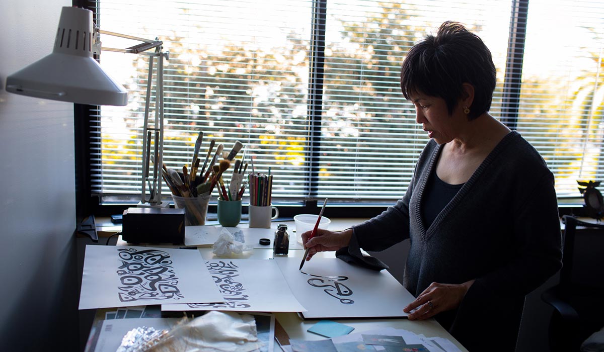
The crew of 9 felt totally involved in that unusual project, most notably art director Christophe Vacher, well-known for his experience at Disney as a background artist (A Goofy Movie, Runaway Brain, The Hunchback of Notre Dame, Hercules, Tarzan, Fantasia 2000, Treasure Planet), concept artist (Dinosaur) and art director (Enchanted), as well as at DreamWorks (Shark Tale), and also as a painter, mostly inspired by the Romantics and the European Symbolists.
All these influences and his impressive background nourished the universe of 9 with a unique way of enhancing the film’s dramatic and emotional impact, as you shall see in the beautiful artwork Christophe has kindly provided for this article.

 Animated Views: What was the process of working on 9?
Christophe Vacher: That production allowed me to work in a context different from the one I had worked the previous years insofar as Focus Features is an independent studio. It worked differently from studios like Disney or DreamWorks. It can be more difficult because you have to set up much more things, but at the same time, it can be much lighter from the internal politics viewpoint. Also, everyone was very excited about the project, very different from everything done before. When a director hires an artist, that’s not just about talent. It’s also about knowing if they’ll have a good human and working relationship. Fortunately, we got along very well at once. The subject spoke to me. It was different. That was exactly what I was looking for.
AV: How did you join the crew of the film?
CV: I discovered Shane Acker’s short film at a time it was just a film on the net. Back then I was the art director of the animated segment of Enchanted and a friend of mine sent me an email with a link to it. I did like it, and shortly after that, it was nominated for the Oscars and it was decided to make a feature film out of it. Then, that friend of mine suggested it was a perfect project for me as an art director, yet I was still working on Enchanted. Finally, almost one year later, another friend, Robert St Pierre, proposed me the job on 9. At the time, it was Fred Warter who was intended to become the art director of the film, but for reasons he had left the project after doing some production design for it. It was a perfect timing since I had just finished Enchanted. So, I took the job.
 Click on picture to enlarge
 Click on picture to enlarge
AV: What did you like in the subject?
CV: Whereas my latest paintings are more romantic, my first paintings, in the 90s, were much darker, in the spirit of 9. In fact, I love to work on light. Shane Acker’s short featured all I like, with a very dramatic lighting, a lot of textures, something very dark, almost gothic. The story, also, spoke to me, at the opposite of what Disney and DreamWorks are used to doing.
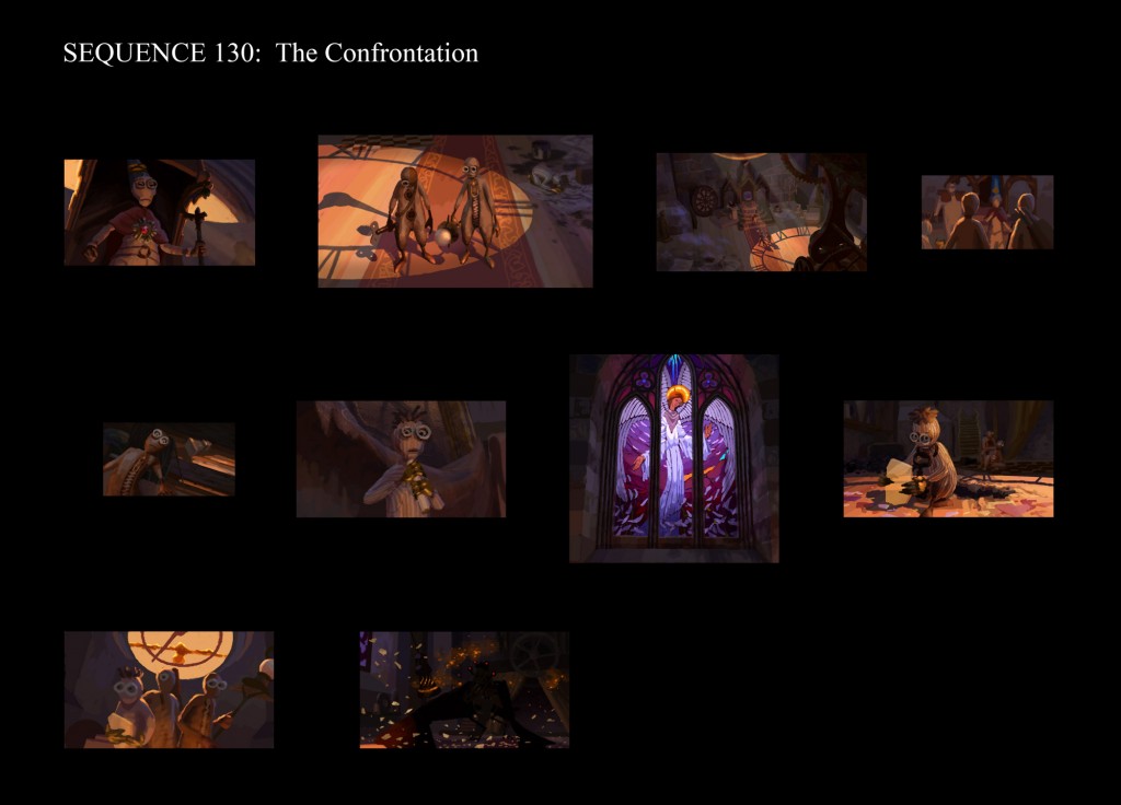
 Seq. 130:Photoshop lighting reajustment.
Click on picture to enlarge
 Click on picture to enlarge
AV: What do you mean?
CV: Disney is very family-oriented. They tried to do things that are different, notably with The Hunchback of Notre Dame, but they soon stopped since that was too remote from their identity. DreamWorks is more teenager or even adult-oriented, but they remain within certain limits, aiming at a wide audience. On the contrary, what I liked on 9 is that the director said: “that’s my project, my story. If you don’t feel comfortable with that, that’s not my problem.” A one moment, he almost left the production, as the studio had some hesitation going so far into that dark aspect. But Shane explained to them that he couldn’t do something different from what he had in his mind. Ultimately, the limit was set to PG-13, and you understand that when you see the intensity of the film.
 Click on picture to enlarge
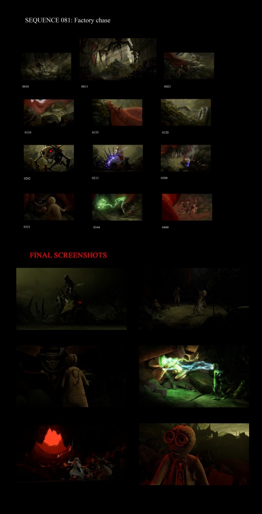 Click on picture to enlarge
AV: Your own pictorial universe is very strong and personal. How did you weave into Shane Acker’s universe?
CV: Pretty naturally, actually. Because most important are the principles — which are the same in his work and mine — and not necessarily the design itself. I’ve always had a large palette of subjects, going from science-fiction to fantasy. Even if I hadn’t created the world of 9, I saw connections with what I had done before. Also, it was a challenge insofar as the world of 9 is close to World War I, whereas other moments in the movie are more Gothic and medieval. Combining all that together in keeping with that dramatic aspect was an exciting challenge.
 Click on picture to enlarge
 Click on picture to enlarge
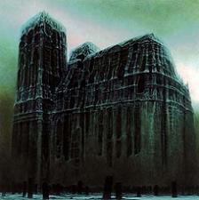
AV: In matter of the work on light, can you tell me about the influence of Zdzislaw Beksinski’s painting [below]?
CV: Beksinki worked a lot on light, color and texture. That said, when I started working on 9, I realized the director was influenced by the same artists as I. I didn’t expect he was interested in Beksinski since very few people in the US know about his painting. In fact, people who love the same things always end meeting, and that creates connections as artistic as human. You could feel Beksinski’s influence in Shane Acker’s short. From then on, it was natural to expand it in a feature film. This way, I could totally understand what he was trying to do in terms of storytelling, combining that kind of esoterism with a human story –since the characters are obviously a metaphor of mankind.
AV: How was your working relationship with Shane Acker?
CV: I knew the director had a reputation of being very meticulous, very hard to satisfy. So, I was surprised that my first works were approved. He came to trust in me and that really helped.
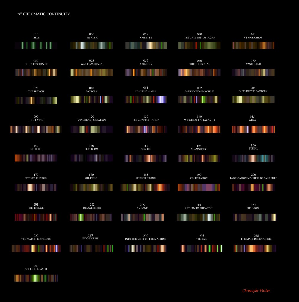 Chromatic continuity: helps the director have an overall vision of the art direction of the film.
Click on picture to enlarge
AV: What is the work as an art director like?
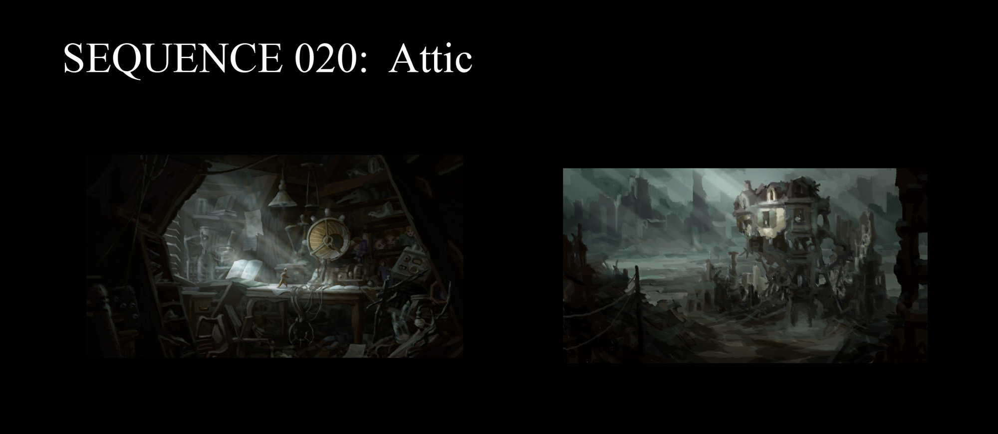
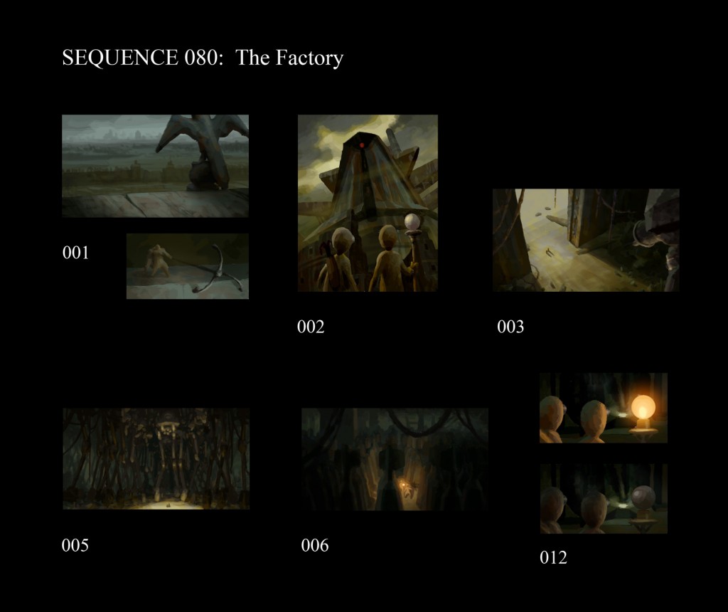
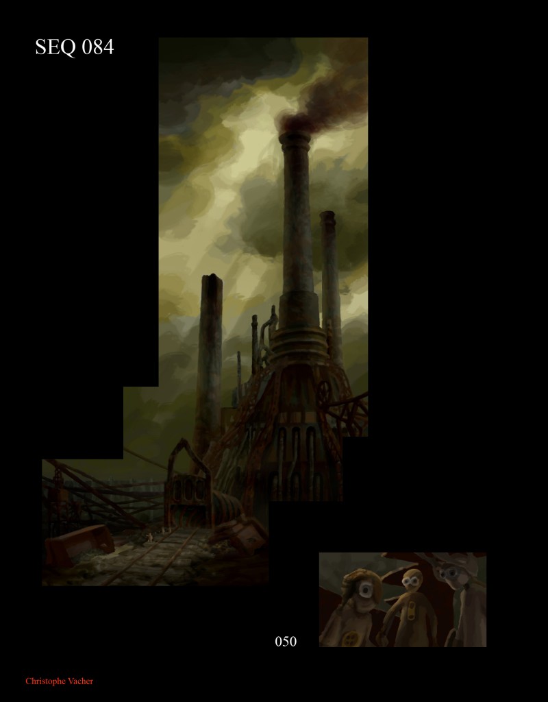
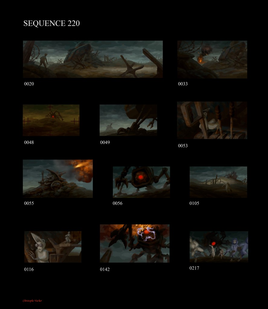
CV: First, what I do is working from the storyboard. I’m looking at each vignette and I choose which ones will be colored in order to serve as a visual guide for the film. That’s the color keys. You can do them for a definite environment or a place that needs to be fully detailed –- here, you make a bigger color key. All those color keys constitute what we call a color script. It is made of very rough, simple vignettes chosen within the storyboard to become key-vignettes for the other departments. I paint them so that all the details allow a perfect understanding of the light, the colors and the textures. It allows the modeler to see what will be seen in the light, so that he can focus on details aimed at being seen on screen. That also gives information to the people in charge of textures, so that they can see where they’ll have to focus on textures and colors.
And, there’s also the lighting department. That’s where I spend most of the time since was have to find lightings that fit exactly to the atmosphere presented in the vignette. That’s where we deal with the emotional aspect of light and colors. Finally, all that goes to compositing, which is located in the same department as the lighting guys, where the image is finalized in adding filters and everything that helps bringing the imagine to completion. In parallel to that, there’s of course the animation. My job is not to control animation -– that’s the animation director’s job — but I nevertheless have a look on it so that there’s no flaws in the textures. I look to that with the director, the production designer and the animation director, and then, for the final artistic aspect of the image, there’s only the director and me –- and the ultimate “ok” is the director’s.
Here, generally speaking, is the process. I start it, I supervise it all the way to the end and I’m looking at the final product just before it’s wrapped up.
 Click on picture to enlarge
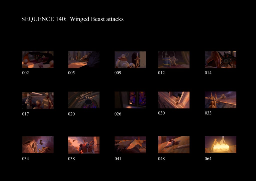 Click on picture to enlarge
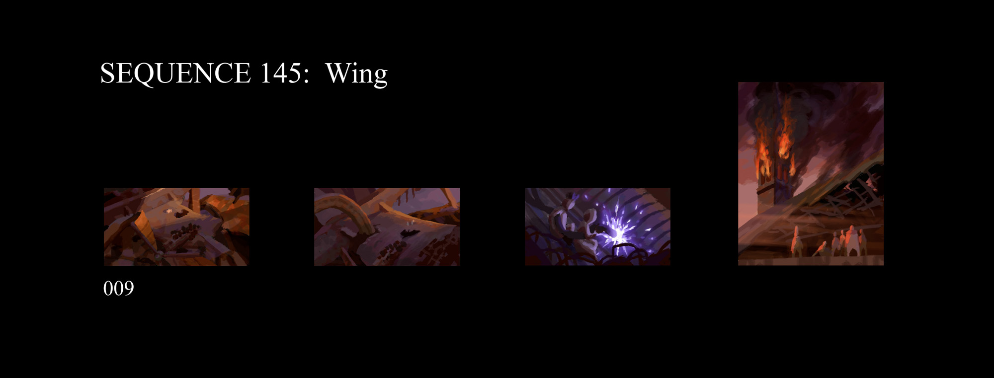 Click on picture to enlarge
AV: Please, could you explain us how this works through a specific scene?
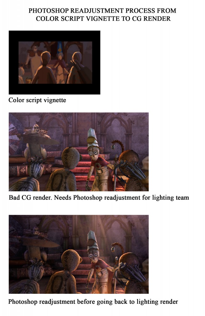
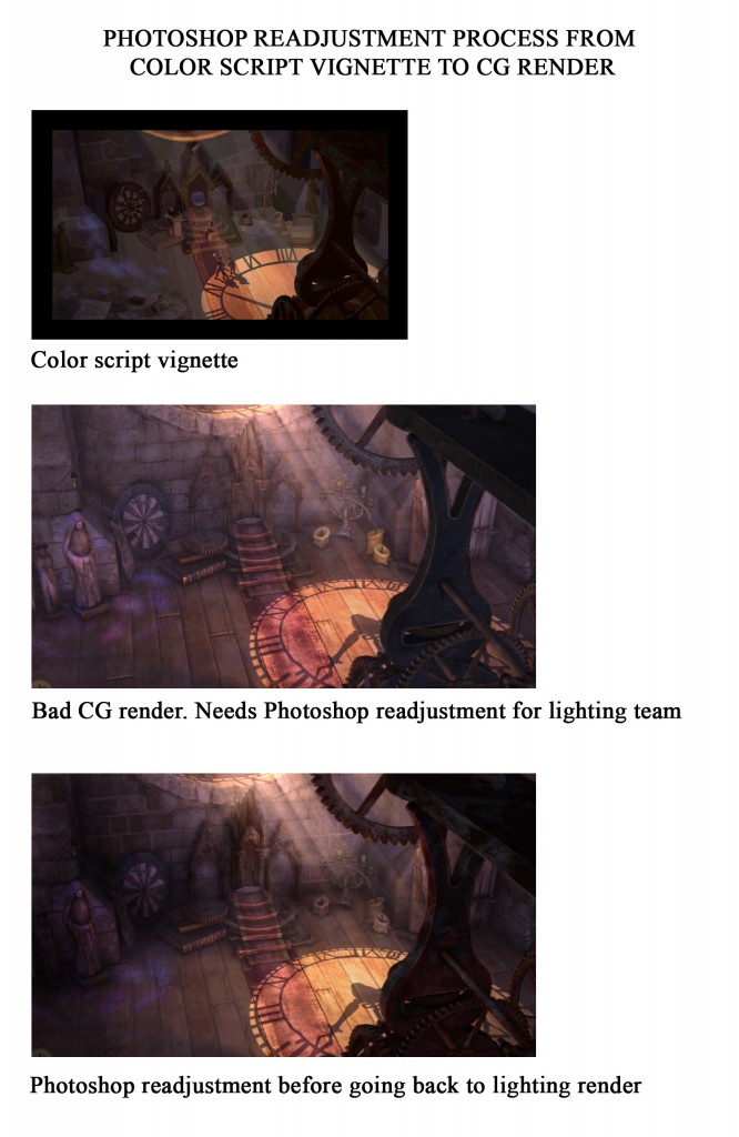
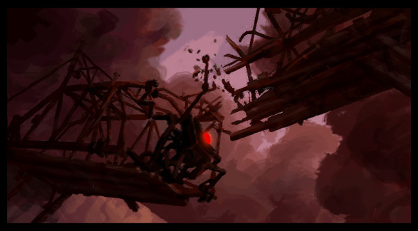
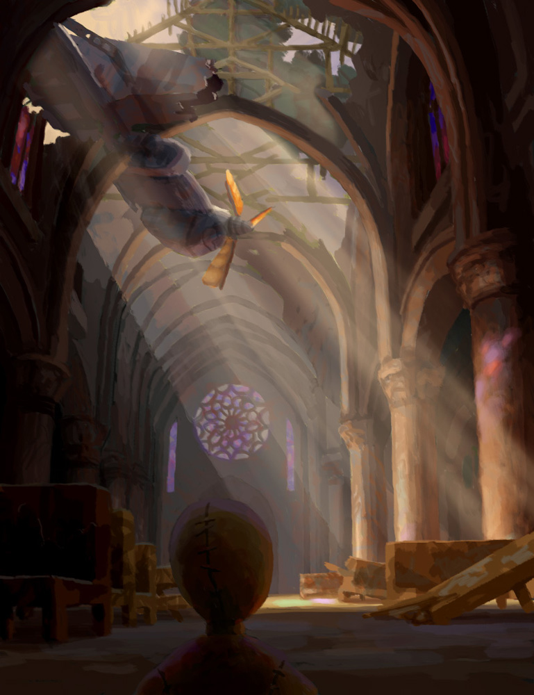
CV: Let’s take one of the sequences that may have helped convince Universal Studios (the film’s distributors) that 9 was worth a fine promotion: the central action sequence in which the heroes are attacked by the winged beast in the church –- probably the most intense sequence in the film [illustrations Seq. 130 – 140 – 145, above].
Before the beast arrives, we chose a sunset sequence in which the clock on the window casts a shadow on the ground so that we can see a circle in which 9 and 5 stand. The light is reddish, less intense. I intended to have less saturation at the beginning, and as the action get more and more intense, the colors get more and more saturated, with the warm colors –- especially the reds — more saturated than the cold ones. Actually, from one department to the other, you don’t always have time to materialize exactly these ideas, but that was a progression we always kept in mind. From the moment the winged beast breaks the window and gets in, with the censer that sets the room on fire, the intensity rises and my color script reflected that progression. Now, in the film, I’m not sure the spectator necessarily sees that, but that’s the direction we followed.
 Click on picture to enlarge
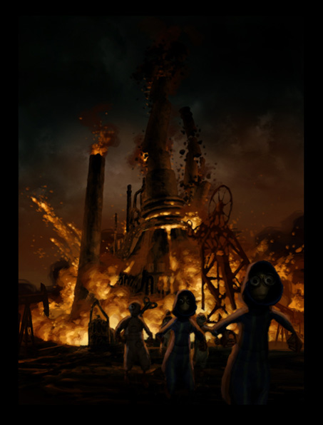 Click on picture to enlarge
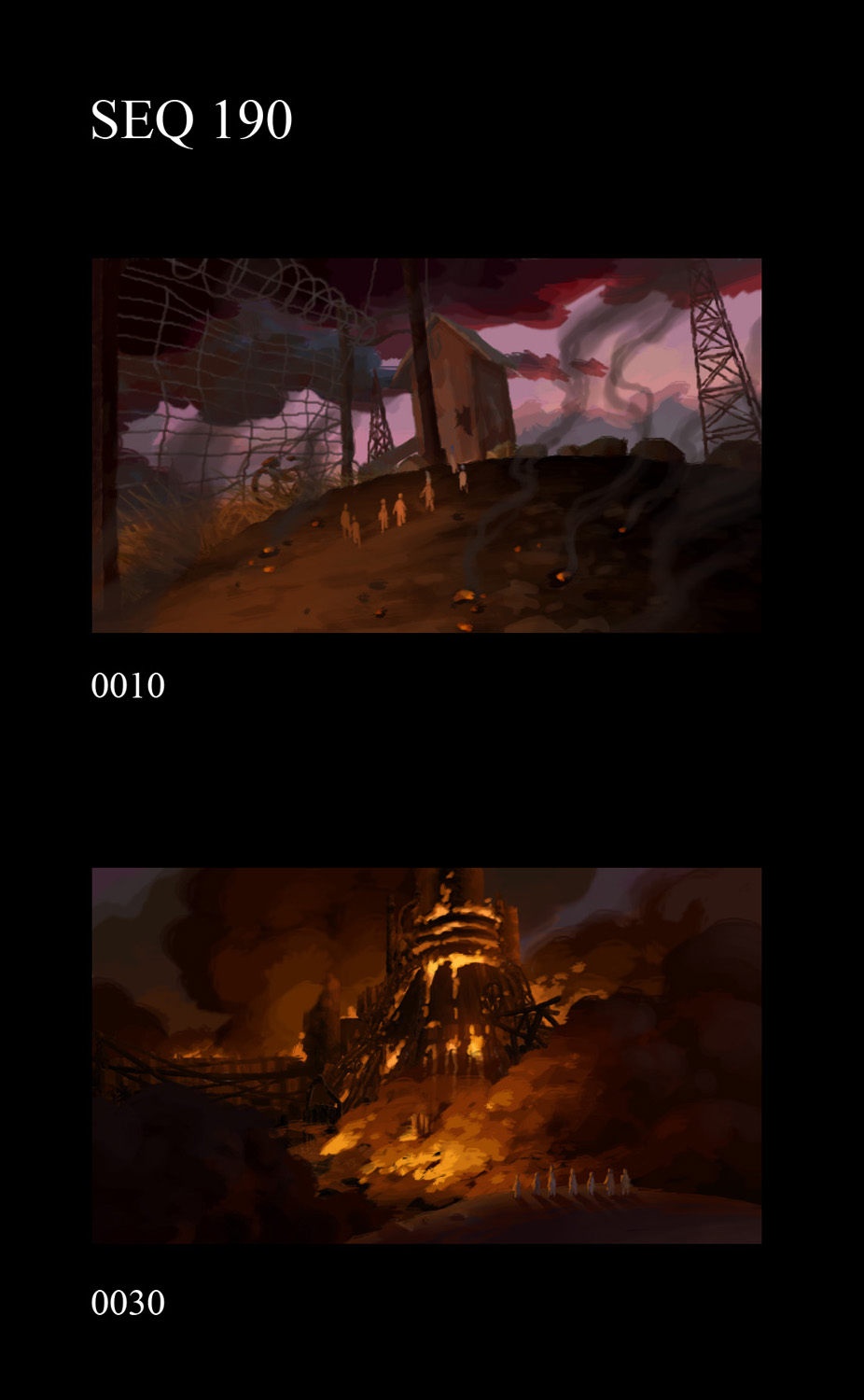 Click on picture to enlarge
AV: Where was the film produced?
CV: In fact, the production was very much eventful. All the design, the pre-production, started in Los Angeles, and when the production started, the film flew to Luxemburg. There, things didn’t turn out as they should have and the production was almost stopped. Focus Features, whose headquarter is in Los Angeles, tried to find a new place. Ultimately, Starz Studio, in Toronto, completed the movie. About 15 minutes were also produced in Pasadena, in Ken Duncan’s studio. He comes from Disney, and it is at his studios that I finished the film.
 Click on picture to enlarge
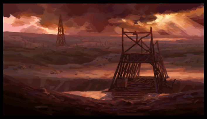 Click on picture to enlarge
AV: Ken Duncan (animator of Meg and Jane Porter, among others), the Brizzi brothers (story artists on 9, and also on The Hunchback of Notre Dame and Fantasia 2000) and Robert St Pierre (production designer on Mulan II) come, just like you, from Disney before working on 9. What are your memories from your experience at the House of Mouse?
CV: I keep a lot of great experiences from there, and especially on The Hunchback of Notre Dame. We worked in Disney’s Paris facility, the first studio to be opened overseas. We were 15 minutes far from the actual Notre Dame cathedral, which we could see every day. From someone passionate about Gothic architecture like me, working on such a film was amazing! Then, I joined the Disney Studios in Burbank. Working for Disney in France was a dream come true and then working for them in America was truly unbelievable! In Burbank, nothing seemed impossible. The atmosphere was incredible, with parties almost everyday. That was a wonderful time. That was just before all-CG movies, which totally changed the environment of traditional animation, came out. Fortunately, after a short while, a lot of traditional animators adapted themselves to that new medium.
 Click on picture to enlarge
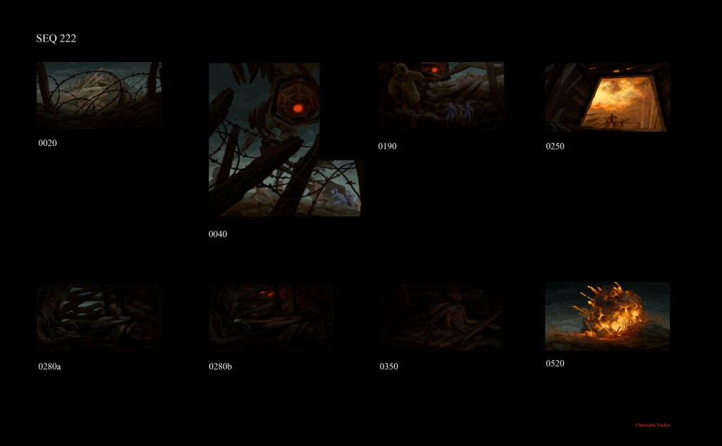 Click on picture to enlarge
AV: How did you adapt yourself?
CV: The first step was to get to painting by computer. That was during the visual development of Dinosaur. I discovered the first versions of Photoshop. It is with Tarzan that I got into 3D, with the backgrounds made out with Deep Canvas, a software that was also used for Treasure Planet. We didn’t necessarily understand everything. The technical director was guiding us. Then, I left Disney to concentrate on painting. Then, I worked for one year for DreamWorks, and took 3D lessons meanwhile.
After DreamWorks, I decided to take full-time lessons for one year and a half. I entered a world I did know nothing about. The first time I opened Maya, I was overwhelmed by the size of the software! Right after that 3D school, Kevin Lima contacted me to become the art director of the animated part of Enchanted. That 3D training has helped considerably to understand how all the elements work together and understand the whole process of making a all-CG movie. It’s a whole new world that opened for me, in which I have been working since then on 9 and soon on the third of the Tinkerbell movies, for a few weeks.
I’m presently talking with the Imagi studio about the possibility to art direct their upcoming CG feature film, Gatchaman, a science-fiction/action movie based on the animated series of the 80’s, Battle of the Planets.
But, as we say it, that’s another story…
 Click on picture to enlarge
is available to order now from Amazon.com
![]()
With all our gratitude and appreciation to Christophe Vacher.
All artwork ©Focus Features/Universal, 2009.